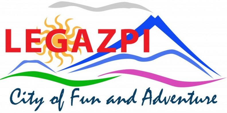
The City Tagline

Logo designed by: Mr. Yves Yu
SHADES USED IN THE TAGLINE:
BLUE—(color of Mt. Mayon Volcano, Sleeping Lion, Ligñon Hill)
This shade symbolizes peace and orderliness as these are the top priorities of the City Government.
RED—(color of “Legazpi”)
This strong color symbolizes the quest of Legazpi for the continuous progress and development
DARK BLUE & DARK GREEN—(found in the tagline)
These 2 colors symbolize the marine resources in the city
Renowned worldwide, the City of Legazpi embraces the transition from once a humble city to the ever-developing largest city in Bicol region. It is an embodiment of a mother that continues to cultivate its children– the natural wonders confined within its boundaries and yet, it aspires to become more.
Over the years, Legazpi City thrived and succeeded to be in line with the most competitive cities in the country. With hard work and consistency at the heart of his governance, Mayor Noel E. Rosal resolutely brought Legazpi City to new heights of socio-economic development and paved the way for the city to be classified as one of the country’s top tourism destinations.
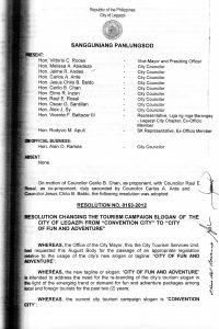
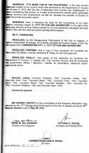
The City of Legazpi was dubbed as “City of Fun and Adventure,” per Sanggunian Resolution No.0153-2012 on May 17, 2012. Rebranding was made to be in line with the national tourism development program of the same year, 6th of January, when the Department of Tourism of the country launched the campaign slogan, “It’s More Fun in the Philippines.”
The city is one of the regions center for commerce and tourism. The business groups that invested in Legazpi denotes it as a center for tourism investment in Bicol. It is the destination for business and leisure, where one can escape the congestion and traffic of other cities in the Philippines. So if one wants to immerse in the simplicity and the more laid-back foreground of a city, Legazpi has a lot to offer with its interesting facilities for meetings, incentives, conventions and exhibits (MICE), travel and tour packages natural wonders and people bestowed upon it.